Friday, 31 May 2013

02.11 Depth

Photography, like Renaissance painting, seeks to manipulate perspective; to reduce or enhance feelings of depth in the image. Control of perspective, and therefore management of image depth, may be achieved using the below. However when applying these controls, you must remember that each image has its own viewpoint - its own distinct frame of reference - which is quite separate from viewpoints outside of its frame. (See later post).

Controlling Depth Clues

Strengthening depth
  • multiple connected planes
  • use a wide-angle lens very close to the subject, angled to a distant object
  • more directional lighting, less diffused lighting
  • brighter tones in the foreground, darker tones in the background
  • warmer hues in the foreground, cooler hues in the background
  • have a short depth-field of focus such that the subject plane is in focus but those on other planes are less so
  • place relative scale markers (e.g. human figures) as reference points on each plane

Diluting depth
  • fewer planes, disconnected
  • use a telephoto lens (or zoom facility) with a viewpoint as far away from the subject with few distance reference markers in-between
  • less directional lighting, more diffused lighting
  • darker tones in the foreground, brighter tones in the background
  • cooler hues in the foreground, warmer hues in the background
  • maximise the depth-field of focus so that distant objects are as sharp as nearby ones
  • reduce atmospheric haze (using filters) to compensate for tonal changes

Thursday, 30 May 2013

02.10 Perspective

Perspective is the appearance of objects arranged in space, from the viewpoint of the observer. It is one of the defining characteristics of Renaissance art, distinguishing it from the late-medieval Gothic art which preceded it, and one of the reasons why this project on visual composition began.

Optics presents distant objects as being comparatively smaller than identical ones nearby, and yet, our brain is able to understand them as being small and yet full-scale simultaneously. Multiple identical points arranged into two lines equidistant from each other; for example, milestones on either side of a straight road, will appear to get closer to each other (converge) as we travel further away from them, even though we know they remain the same distance apart. This is the perceptual phenomenon of "scale constancy".

We should have a conscious knowledge of the perspectival clues our eyes recognise when comprehending depth, as a necessary first step to being able to control the feeling of depth in an image.

Perspectival clues
  1. Linear perspective
    Two or more parallel lines converge or imply convergence at a distant vanishing point. This applies vertically as well as horizontally, but the latter is easier for the eye to accept.
  2. Diminishing perspective
    A special instance of linear perspective, where objects of known scale have aspects in inverse proportion to their distance from the viewer e.g. a single row of trees receding into the distance.
  3. Aerial perspective
    Contrast and colour tone diminish as distance increases due to diffusion by atmospheric haze.
  4. Colour perspective
    Air absorbs warmer-hued light (longer wavelengths) than colder-hues; we perceive warmer colours as advancing and cooler colours as receding.
  5. Tonal perspective
    As a result of our reality-exposure to atmospheric diffusion, we perceive higher contrasts as being closer to us and lower contrasts as farther away.
  6. Sharpness
    Diffusion of light due to atmospheric haze makes the outlines of distant objects less sharp.

Wednesday, 29 May 2013

Piazzale Michelangelo, Florence

Photograph Copyright ©2013 Loo Yen Yeo. All Rights Reserved.
Concepts: Frame shape (an uninsistent frame)

Description: A bright clear day on Piazzale Michelangelo overlooking Florence. The scene abounds with colours, textures, and points of interest - there is plenty of potential for re-composition through cropping.

Title: Florence uncut


Photograph Copyright ©2013 Loo Yen Yeo. All Rights Reserved.
Concepts: Cropping; Horizon (emphasising sky)

Description: A strong crop from both top and bottom frame edges with more space given over to the sky, the original width is retained. The eye sees the arrow-like high cloud formation right-of-centre which directs it down to the hill onto the spires of Florence. The thin ratio of ground to sky is intentionally unbalanced, concentrating the eye strongly on the Basilica di Santa Maria del Fiore. Despite the higher proportion of sky, the most visual tension centres around the Duomo.

Title: Heaven on Earth


Photograph Copyright ©2013 Loo Yen Yeo. All Rights Reserved.
Concepts: Cropping; Horizon (foreground interest)

Description: A crop from both top and bottom frame edges with space given over to the foreground, the original width is retained. Palazzo Serristori, the reddish-brown mansion in the centre, is the visual fulcrum of the image  - an apex of at least three triangles with Brunelleschi's dome and Torre d'Arnolfo; Brunelleschi's dome and the viewing platform; and with the topiary hedge.

Title: Seeing Florence


Photograph Copyright ©2013 Loo Yen Yeo. All Rights Reserved.
Concepts: Cropping; Horizon (similar proportions)

Description: A crop from both top and bottom frame edges with emphasis upon the middle distance, the original width is unchanged. This time Torre d'Arnolfo is the first draw, followed by Palazzo Serristori, and then Brunelleschi's dome creating a single triangle. Ponte Vecchio assumes more prominence, setting up a line through the tower and dome, and a lesser triangle with the tower and the palazzo. This is a simpler, more coherent composition to that with foreground dominant.

Title: Three Icons


Photograph Copyright ©2013 Loo Yen Yeo. All Rights Reserved.
Concepts: Cropping; Frame shape (shooting vertically)

Description: An all-around crop to vertical format is possible. In this case the message is the human activity of the foreground against a historic city backdrop. The fore and mid-ground textures would be too dense if they weren't balanced by suitable expanse of sky.

Title: --

Photograph Copyright ©2013 Loo Yen Yeo. All Rights Reserved.
Concepts: Cropping; Frame shape (the square frame)

Description: An all-around crop to the challenging square format. Composing in a square frame can be awkward, and cropping helps us achieve it post-capture. Although the perspective best shows off the direction of light on the bell tower of Chiesa di San Niccolò in the lower right, and then the curve of the Arno sweeping up to the three bridges, there's a touch too much sky for perfect balance - but that lends a restless energy to this composition.

Title: --

Tuesday, 28 May 2013

01.08 Cropping

Cropping is part of the optional editing process which happens after the photograph has been taken. It occurs often in the print-making from black-and-white film, where darkroom development is within easy reach. Print-making from colour film is much more complicated, and most photographers resort to commercial labs where the process is taken out of their hands. However with the advent of digital photography, the editing process has seen a resurgence.

Cropping, or the process of removing sections from the image frame inwards, is very powerful because:
  • it can alter the visual composition and hence the message of the image;
  • design decisions can be deferred from the instance of image capture; and
  • it allows for new possibilities of composition to be explored.
The trade-off is that cropping is a subtractive process - there is a loss of information, so images should be taken in as high a resolution as possible. Excessive reliance of post-production processes, especially cropping, can lead to sloppy composition at the time of capture. It's always better to start off with the best possible original material.

Monday, 27 May 2013

Castel Sant'Angelo by Night, Rome

Photograph Copyright ©2012 Loo Yen Yeo. All Rights Reserved.
Concept: Curves (relationship to straight lines); Curves (implication); Multiple points (line dynamics)

Description: The curving sweep of the Tiber's northern bank accelerates the eye towards the sodium-lit ramparts of Castel Sant'Angelo, the brightest-lit patch of the photograph, and then across Ponte Sant'Angelo (perpendicular to the curve's tangent at that point) to the southern bank.

Title: Sant'Angelo - a beacon in Tiberian night

Sunday, 26 May 2013

03.06 Curves

Curves can be viewed as comprising a series of very short lines of gradually changing orientation. This gives curves special set of design properties.
  • A sense of rhythm and speed, and therefore of flow.
  • An overall orientation (based on the sum of fragment orientations) and therefore a sense of direction.
  • A smooth dynamic on account of their linear fragments' gradual changes in orientation.
  • A feeling of enclosure because curves are fragments of circular/elliptical circumferences.
Thus a curve will interact a straight line, and the dynamics of that interaction will be most influenced by the curve fragments closest to the straight line. This has three practical effects:
  1. if the orientation of the curve fragment and the straight line is the same (i.e. parallel), then there is low dynamic tension, and a reinforcement of flow.
  2. if the orientation of the curve fragment to the straight line is perpendicular (i.e. at a right-angle), then there is high dynamic tension and a redirection of flow to the radial centre of the curve (i.e. the curve's focal point).
  3. curves interact less with the image frame, because dynamic tension is not maintained over the length of their relationship.
Curves are useful design tools because of their powerful ability to direct the viewer's eye; either along their length by flow or to their focal point by implication.

Curves cannot be artificed by the photographer (without the use of a fish-eye lens, in which case, then everything in the image will be curved), they have already to exist in real life perhaps by momentary implication. What can be controlled is the degree of curvature, which can be affected by acuteness of viewing angle.

Saturday, 25 May 2013

Hunting in the Garden of Roses, Oltrarno, Florence

Photograph Copyright ©2013 Loo Yen Yeo. All Rights Reserved. 
Following a stream of tourists on their ascent to Piazzale Michelangelo in Florence's Oltrarno district, I stumble across Giardino delle Rose whose modest side-entrance barely registers with the climbing barbarian horde. Jean-Michel Folon's installation, 'Partir', is a red rag to a bull.

Photograph Copyright ©2013 Loo Yen Yeo. All Rights Reserved.
It's pretty obvious that Jean-Michel's drawn from Masaccio's 'Holy Trinity' in Basilica di Santa Maria Novella; there has to be one sweet spot where everything comes together, but there's no handy 'x' on the floor. Close-up and focussing on the installation doesn't cut it.

Photograph Copyright ©2013 Loo Yen Yeo. All Rights Reserved.
A slightly lower vantage point and focussing on Palazzo Vecchio's bell tower remains unconvincing. The sweet spot must be behind me and I start drawing back. Also, there's no visual 'hook', no relationship... apart from the installation to the view, which would only result in a "that's nice" sort of picture.

Photograph Copyright ©2013 Loo Yen Yeo. All Rights Reserved.
As I back up, a fellow tourist-photographer walks into shot. Suddenly there's the possibility for a stronger three-way relationship between her, the installation, and the view.

Photograph Copyright ©2013 Loo Yen Yeo. All Rights Reserved.
I want to keep my distance so that my presence doesn't distract her, so I use the zoom on my hand-held camera; and take two steps to my right to bring Palazzo Vecchio's belfry deeper into the installation frame. I'm still missing the sweet spot.

Photograph Copyright ©2013 Loo Yen Yeo. All Rights Reserved.
One more step to the side and I'm there. The relationship between the girl and the frame is good, but the interaction between my camera's frame and 'Partir' feels wooden. Also I'd like to exclude the gentlemen on the left from the shot - I turn my camera on its end and soften my knees to lower the perspective, so that I can look 'through' the ship's funnels more...

Photograph Copyright ©2013 Loo Yen Yeo. All Rights Reserved.
The moment's perfect - we're looking at her, and also what she's looking at. The lower perspective unifies the relationships and also positions central Florence through the ship's funnels, heightening the depth of our visual field. The framing adds dynamism and excludes the unbalancing presence of the two men, while retaining their shadows to add symmetry. The young woman and her scarf counterweight the square patch of paving.

Friday, 24 May 2013

06.02 Hunting

Hunting is the process of resolving coherent, emotionally-engaging images from places-situations where environmental factors are cannot be controlled. It requires the artist to:
  • perceive what is special about a scene,
  • interpret it, and then
  • capture it in a way that conveys its essence to the viewer.
It's because of this reactive, transitory nature - the conjuring of successful photogenic images from messy everyday events - that reportage (photojournalism) and street photography are considered the pinnacle of the professional's art.

Thursday, 23 May 2013

The Walls Of San Marino

Photograph Copyright ©2012 Loo Yen Yeo. All Rights Reserved.
Concept: Horizon (foreground interest); Itten's contrasts (smooth/rough); Itten's contrasts (narrow/broad); Perspective (aerial); Perspective (linear)

Description: Although the horizon is located slightly above the mid-line, the aerial perspective increasingly mutes the colours of Emilia Romagna in the distance, making the horizon feel lower. The visual convergence of the handrail leads the eye into the scene enhancing the sense of perspective, climaxing in a dramatic plunge to infinity. A featureless blue sky balances the stone wall with contrasting texture and colour tone.

Title: A Plunge Into Infinity

Wednesday, 22 May 2013

01.06 Horizon

The most common instance where the image frame is necessarily divided, is in landscape photography when a horizon line is present. The placement of the horizon at any level from low to middle to high in the frame is open to choice, all things being equal. However there is a tendency to place it closer to the bottom of the frame because it confers upon the image a sense of stability.

Interest
If there are attention-grabbing items of interest in the foreground, then it's natural to want to make a feature of it, therefore the horizon would be high in frame. The converse is true if there are spectacular cloud formations or airborne entities.

Colour and contrast tones
There may colours or tonal weights featured in the foreground and sky that need to be proportionately balanced.

Personal expression
In many instances, several options for placing the horizon become available; in which case, it comes down to a matter of taste and what you desire to communicate.

Tuesday, 21 May 2013

Historic Florence

Photograph Copyright ©2013 Loo Yen Yeo. All Rights Reserved.
Concept: Dividing the frame (Fibonnaci); Frame shape (the 4:3 frame)

Description: Historic Florence. The verticals formed by the campaniles of Palazzo Vecchio, Giotto, Badia Fiorentina and Bargello, and the Duomo's dome itself; and the horizontals of the coloured façades delineated by the terracotta roofs all the way to the hills beyond, divide the image frame into harmonious Fibionacci ratios.

Title: Belvedere Vision

Monday, 20 May 2013

01.05 Dividing the frame

The placement of any element within the image frame, even a small one (see single point), divides the frame. For example, placing a one element dead centre in the frame automatically divides the frame geometrically in a 1:1 ratio in height and width. The number of sections, and the relative proportions into which the image area is divided is fundamental to any consideration of visual composition. There are an inconceivable number of division strategies; rectilinear or triangular, with the former the most common.

Simple geometric
Uses ratios of whole numbers e.g. 1:1, 1:3, 2:3, most famously utilised in by Renaissance artists like Brunelleschi in architecture. This leads to static, relentless compositions.

Golden section or golden ratio
An ancient Greek division where the ratio of the smaller part to the larger part (small:large) is equal to the ratio of the larger part to the sum of smaller plus larger part (large:small+large). Algebraically, if the area of the small part is S and the large part is L, then S:L = L:(S+L). This works out as the ratio with the irrational number 1:1.618

Fibonacci
Where the next number of the sequence is the sum of the preceding two e.g. 0,1,1,2,3,5,8,13...

In a real-world context, elucidation of the ratios of frame division in successful images tends to occur after the fact. The main exception to this is often-used and sometimes abused 'rule of thirds'; where two horizontal and two vertical lines dividing the image frame into nine equally-sized sections are imagined, and the subject is placed at any of the four intersections. It's common because it is easy to calculate and indeed, some digital cameras have an option to superimpose the rule-of-thirds grid on the viewing screen.

Sunday, 19 May 2013

Bernini's Baldachin, Saint Peter's Basilica, Vatican City

Photograph Copyright ©2012 Loo Yen Yeo. All Rights Reserved.
Concept: Placement (secondary point of interest); Placement (subject vector); Triangles (vertical convergence)

Description: Gianlorenzo Bernini's baldacchino towers twenty metres over the main altar, and yet is dwarfed by Michelangelo's dome more than a hundred metres above it. This shot captures the detail of Bernini's design - the helical columns based on the legend of those from Solomon's temple, and the flaring dove of the Holy Spirit - with heavy use of diagonals to maintain the writhing energy. The dynamic off-centre placement is balanced by the Medallion of Saint John the Evangelist in the spandrel, top-right.

Taken close-up with a wide-angle lens, the helical spin of the bronze columns create a vector upwards to convergence point (the dome's lantern) just out of frame i.e. a vertical triangle was implied to give a sense of scale.

Title: The Dove and the Eagle

Saturday, 18 May 2013

01.04 Placement

If a decision is made not to fill the frame - that is, to show the subject in its context - it becomes important to consider where the subject should placed in the image frame so that it best communicates its relationship with its setting. As the subject decreases in size, its context increases in importance, and therefore the more crucial is the subject's placement. The most obvious placement is in the centre, but this generally makes for a static, unyielding picture; and yet locating the subject to an extreme point, while dynamic, can come across as eccentric or contrived unless there is clear reason for it.

In practice, the communicative-aesthetic placement of the subject can be justified by:
  • a second point of interest or evidence of it (if out of shot) such as the sun and direction of sunlight, or
  • a vector, like the subject's direction of motion or way it faces.

Friday, 17 May 2013

Bacchus, Gallery of the Candelabra, Vatican Museums, Vatican City.

Photograph Copyright ©2012 Loo Yen Yeo. All Rights Reserved.
Concept: Itten's contrasts (light/shade)

Description: The light from a summer's setting sun pours through the Gallery of the Candelabra, bathing this sculpture of young Bacchus in honeyed tones. The God of Wine is identifiable by the wreath of ivy and grapes in his flowing hair; the Thyrsus, a staff of giant fennel (Ferula communis); and the panther who nursed him as an infant.

Title: Honey

Thursday, 16 May 2013

Victoria Ivanova at Teatro Titano, San Marino

Photograph Copyright ©2012 Loo Yen Yeo. All Rights Reserved.
Concepts: Motion (complex streaking); Itten's contrasts (black/white); Balance (imbalance); Dynamic tension (single object)

Description: Victoria Ivanova's solo performance "Dervish tours" was captured in San Marino's national theatre, Teatro Titano, during the 32nd World Congress on Dance Research. The world's top dance professionals and researchers were brought together for a magical weekend in late June 2012 by Unione Folclorica Italiana (UFI) under the auspices Conseil International de la Dance (CID) UNESCO.

The framing of Victoria's twirling figure is deliberately offset creating dynamism through imbalance (in the conventional sense). However her orientation into larger space prevents the visual weight from pitching too far to the right; if she were to face the other direction, there would be greater imbalance and sense of progressive movement to the right.

Title: Victoria

03.13 Motion

Images are not always about sharpness; about whether something is in focus or not. Blurredness is also a tool used in creative expression, and in this case, to communication a feeling of motion and speed. There are three elemental kinds of motion blur:
  1. complex streaking - created when the subject is in motion and the camera is not
  2. linear streaking - from the panning of the camera or moving camera mount
  3. jarring blur - shaking the camera results in a subject image with ghosted double-edges
The blurs may be combined. For example: panning to capture a twirling dancer moving across the stage.

Wednesday, 15 May 2013

Coniglio Disossato, Osteria de Borg, Rimini, Italy

Photograph Copyright ©2012 Loo Yen Yeo. All Rights Reserved.
Concepts: Multiple points (line dynamics); Multiple points (implied shape)

Description: Food is another passion of mine, and this cold dish of boned stuffed rabbit in a ginger sauce was perfect on a hot summer evening (it scored a 10 out of 10). The black circle of pitted olive on the right is the point that captures the eye first, then the one on the left creating a left-ward line of movement that tugs against the bottom of the frame. The angle of the plane of the two black points then leads the eye to the leftmost slice of carrot then to the top one, forming a quadilateral. The orange-coloured points of carrot imply a circle, framing the main content.

Title: Star rabbit

03.02 Multiple points

Having two or more points increases the complexity of the image immeasurably over that of a single point because the eye naturally then wants to move between the points, establishing a line. Having several points therefore creates:

Line dynamics - through the factors of relative position, distance, angle, direction, and relationship with the frame.

Implied shapes - if there are three or more points, and the eye is led to flow around the points in sequence to closure.

Monday, 13 May 2013

Guaita Rocca, Republic of San Marino

Photograph Copyright ©2012 Loo Yen Yeo. All Rights Reserved.
Concepts: Triangles (upward-pointing)

Description: In this view north-west from the donjon (watchtower) over San Marino, there are three upward-pointing triangles: the two converging lines of the left and central fortified walls with the window sill; the sunlit roof in the centre, with the shadow of the belfry as negative space; and the line of roofs on the left with the Palazzo Publico near its apex converging with the left edge of the belfry.

Title: Sanmarinese Summer

Sunday, 12 May 2013

03.08 Triangles

A triangle is the simplest shape to establish in composition and yet it is one of the most powerful. All it requires is just three points in the visual field, each becoming a corner of the triangle (excepting when the points lie on a line). Unlike circles or rectangles whose points are highly constrained, a triangle's points enjoy freedom of placement.

A triangle can also be created with a minimum of two convergent lines, the third side being formed by the camera frame. Convergent lines abound in nature, most commonly in linear perspective where planar boundaries meet or imply meeting at the vanishing point.

Composition makes use of triangles as a unifying motif when there is little or no control over the shooting environment - as in reportage photography - to add clarity to a visual presentation.

A triangle is made by:
  • implication - three points which the viewer's eye connect to closure
  • lateral convergence - the top and bottom boundaries of a vertical plane (e.g. a wall) meeting at a horizon's vanishing point
  • vertical convergence - the side boundaries of a vertical plane (e.g. wall), when seen through a wide-angle lens, appear to converge at a vanishing point above the plane.
Triangles can take two forms:

Upward-pointing
Where the baseline is at the bottom/front and apex at the top/back. This orientation is associated with a sense of stability with lightness wrought by the diagonals, as compared to the stable-but-heavy rectangular arrangement.
Downward-pointing
Where the apex is at the bottom/front and baseline at the top/back. The inverted position conveys a feeling of instability, dynamism, aggressiveness and movement.

Saturday, 11 May 2013

Jean-Michel Folon's 'Partir' (2002), Giardino delle Rose, Oltrarno, Florence

Photograph Copyright ©2013 Loo Yen Yeo. All Rights Reserved.
Concepts: Frames within frames (enhancing perspective); Quadrilaterals (rectangle)

Description: Jean-Michel Folon's 'Partir' (2002) in the Garden of Roses was specifically created to frame a view. But what changes elevates this above clichĂ©, is that we are witnessing the relationship a viewer (the young lady) has with a work of art. The outer frame in portrait orientation creates steep diagonals with the landscape-orientated briefcase and base, giving a stronger feeling of depth. The slightly formal feel to this composition is because there is only one axis along which the installation can be seen as a true rectangle.

Title: It's A Perfect Day

01.07 Frames within frames

The arrangement of elements within the image to form an internal frame around the subject, a frame within a frame, is a predictably successful technique - so much so that it's less-than-well-considered use has established it as a cliché. However, it is nonetheless a powerful and tasteful device in the right hands and creative eye. 'Frames within a frame' works because it does two things: it enhances perspective, and it introduces movement.

Enhancing perspective
Depth of the visual field is emphasised because another intermediary plane is created and pointed out. There are a minimum, therefore, of three planes: the viewfinder/camera's outermost; the internal frame's, intermediate; and the subject's, innermost. The viewer's eye flits dynamically between the boundaries of the camera frame to those of the internal frame; and the visual momentum causes the eye to move deeper into the internal frame to the subject.

Introducing movement
Depending on the shape or design of the internal frame, the viewer's eye can be made to follow along the periphery of the internal frame before being drawn into its interior.

Friday, 10 May 2013

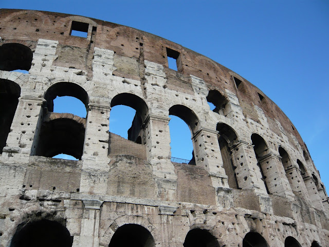
The Flavian Amphitheatre (Colosseum), Rome

Colosseum, Rome
Photograph Copyright ©2011 Loo Yen Yeo. All Rights Reserved.
Concepts: Filling the frame (filling for presence)

Description: The shape of the Flavian Amphitheatre is unmistakable, and taking its form all the way to the edges emphasises its monumentality. The angled perspective accentuates the curvature of the Colosseum's top edge, leading the eye strongly to the right.

Title: Arc of Triumph


Colosseo, Roma
Photograph Copyright ©2012 Loo Yen Yeo. All Rights Reserved.
Concepts: Filling the frame (filling with setting)

Description: A fairly typical context shot of the Colosseum on the Piazza del Colosseo showing its scale, relative to the human form, and its position next to the Arch of Constantine.

Title: Passed to present glory


Colosseum, Rome
Photograph Copyright ©2012 Loo Yen Yeo. All Rights Reserved.
Concepts: Filling the frame (filling with setting)

Description: A different kind of context shot where the Colosseum's lower tiers holding the most visual interest are framed by two pine trees. The amphitheatre's position nestled at the foot of Palatine hill and its impressive height, its upper tier being at the same level as this vantage point at the summit of Palatino, is attractively presented.

Title: Palatine Pines


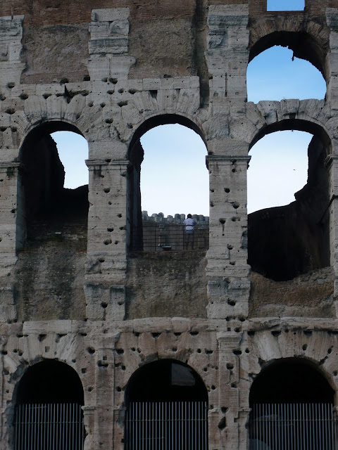
Colosseo, Roma
Photograph Copyright ©2011 Loo Yen Yeo. All Rights Reserved.
Concepts: Filling the frame (over-filling for detail)

Description: Over-filling the frame takes us into the architectural detail of the structure: how the blocks of stone were cut to form the arches, the proportions and rhythms of the archways, the holes where the pins holding the marble façade in place were, and the materials used in its construction.

Title: Defaced

Monday, 6 May 2013

01.03 Filling the frame

Even if there is just one subject to be placed, there is one fundamental choice to be made, "how much of it do we want to see?" This depends on three considerations:

Content of the subject
Is it unusual enough, detailed enough, that we want to see more of it? Think of rare animals or fine works of art.

Relationship with environment
Is the setting of the subject important? Think about the context of the activity taking place and its scale.

Intended impact on the viewer
What do you want the viewer to feel? Strong presences like explosiveness and awe? Or subtler feelings of calmness and curiosity?

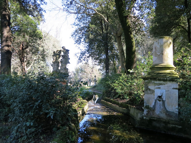
Canale del Drago, Giardino Bardini, Florence

Canale del Drago, Giardino Bardini, Firenze
Photograph Copyright ©2013 Loo Yen Yeo. All Rights Reserved.
Concepts: Frame shape (switching orientations)

Description (above): This image of the Dragon Canal in Bardini Gardens is comfortable/unremarkable because the landscape orientation matches our natural vision, and enveloping, due to the use of a wide angle which has the effect of involving the viewer.

Description (below): Reorienting the camera and recomposing the shot results in a different story. The portrait changes the feeling from comfortable to unusual/remarkable. The perception of depth is increased and the main feature, the Dragon Canal, now becomes an active sinuous element drawing the eye further into the garden.

Title: Creeping up the Dragon's tail

canale del drago, giardino bardini, florence
Photograph Copyright ©2013 Loo Yen Yeo. All Rights Reserved.

Saturday, 4 May 2013

03.01 Single Point

The single point is the most basic of graphical elements. It is small relative to the image, but should contrast with its background in such a way that it is the first thing the viewer sees. An example would be a long distance shot of a sailing boat on the ocean.

Single points may be compositionally placed:
  1. in the centre - usually creating a static image
  2. moderately off-centre - some dynamism
  3. at the extreme periphery - a highly dynamic or unstable image requiring justification

Brunelleschi's Lantern, Basilica di Santa Maria del Fiore, Florence

Brunelleschi's Lantern, Duomo, Florence
Photograph Copyright ©2013 Loo Yen Yeo. All Rights Reserved.
Concepts: Frame dynamics (alignment); Single point (moderately off-centre)

Description: There are actually two alignments: lines of the Temple of the Apocalypse in Vasari's 'Last Judgement' with the top and right edges of the frame; and the lower-most putti [cherubs] seem to jump off the bottom of the frame. The single point is the brightly-lit negative space of the lantern's interior (although  bigger than what one would expect).

Title: Putti-powered flight

04.05 Muted Colours

Muted colours abound in nature, very much more so than bright colours (which are more common in man-made environments). They are referred to as low-saturation, desaturated or subdued colours; and sometimes unflatteringly as 'washed-out', 'less-than-pure', muddy, shadowy or broken colours. Perhaps the way we use language to describe muted colours is indicative of how our attention is more immediately captured by high-contrast, colour-saturated images. But the converse can also be true; that although low-saturation images can have a beauty that is slower to realise, they can have a more enduring appeal.

In terms of composition, muted colours can:
  • lend better opportunities to work with members of the same sector in the colour wheel;
  • offer subtlety and refinement; and
  • project important moods such as gloominess, foreboding, calmness, and contemplativeness.

Friday, 3 May 2013

Fontana dell'Oceano, Boboli Gardens, Florence

Fontana dell'Oceano, Giardino di Boboli, Firenze
Photograph Copyright ©2013 Loo Yen Yeo. All Rights Reserved.
Concepts: Frame shape (vertical subjects in a horizontal frame); Muted colours (subtlety)

Description: The top-line of the hedges enclosing the Isolotto lead the eye to the off-centre placement to the 16th century Fountain of Oceanus (Giambologna). The background of trees with their silvery bark add muted contrast and interest on a cloudy winter's afternoon, giving this image a contemplative feel. The image was cropped to emphasise its horizontality.

Title: Winter Oceanus

Thursday, 2 May 2013

01.02 Frame Shape

The shape of the viewfinder as determined by its aspect ratio - normally of 3:2 (classic 35mm camera) or 4:3 (consumer camera) - strongly influences the composition of a picture, because of there is an intuitive pressure to compose right up to the edges of the frame.

The 3:2 frame has stronger 'orientationality', with most photographs being taken in the horizontal orientation for three reasons: device ergonomics; human field of vision; and the portrait position is perceived as being too elongated.

The 4:3 frame being shorter and fatter, has less orientation bias and exerts less pressure on composition. It is hence less insistent.

The 1:1 frame, like the Polaroid or instagram images, is uncommon for good reason. Few subjects lend themselves to the "tyranny of its perfect equilibrium" (Michael Freeman 2007).

Switching orientations between landscape and portrait, arises out of necessity; although a composition works well in landscape, it may be necessary to re-orientate and re-compose in portrait due to full-page print requirements.

Vertical subjects in horizontal frames can be a challenge. One strategy is to offset the vertical subject to draw the eye horizontally across the photo.

Shooting vertically, there are two important factors to take into account:
  1. the human eye is more reluctant to move up and down than it is from side to side; and that
  2. the bottom of the frame is assumed to be the base, therefore the focus of attention tends to below the frame's centre.
The portrait orientation is commonly used when capturing vertical subjects such as the likes of standing figures, plants, and doorways; and objects moving 'upward' in frame.

Non-bias patterns are most immune to the impact of frame shape on their successful portrayal.